
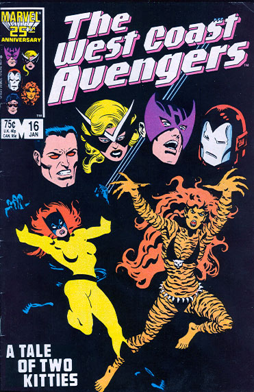
 One of the earliest comic covers that captured my interest at an intellectual level was West Coast Avengers #16 by Al Milgrom. (At right.) It stuck out because, as you can see, it has what might be considered a more graphic approach to depicting characters. If you examine the artwork, you'll see that most of the visuals are conveyed with colored shapes and NOT the black outlines we're so accustomed to seeing in comics. I thought this was wildly clever at the time (1987) and was pleased to see the idea repeated (albiet somewhat less successfully) about a year and half later on the cover of WCA #35.
This was, of course, before I studied graphic design at all, and just as I was beginning to study comic book history. At the time, I was still wholly unfamiliar with the work of Jim Steranko and Frank Miller had just begun experimenting with the idea of removing linework from his work.
I went to college not long after this to study graphic design, and I learned a great deal about color, line and form. The program was rather different than the fine arts program, although we still shared a studio in our foundation drawing classes. In fact, though, very little time was spent on drawing and illustration even compared to photography. We were taught how to depict objects with forms. Minimalism was often encouraged and I particularly enjoyed working on a project where I had to stylize/iconify images from Star Trek, Star Wars, Dr. Who, Flash Gordon, 2001, Alien, Metropolis, Forbidden Planet and War of the Worlds. They were all done entirely using shadows and provided an interesting (for me) examination of how to illustrate without lines.
 It occurs to me though that now, twenty years later, we're still seeing very little in the way of non-line-drawing comics. Even after Miller's brought the idea to such high prominence with Sin City. It's not entirely absent, certainly, and you can see forms of it, to varying degrees, in the work of Mike Mignola, Time Sale, and Frank Espinosa but I would think Miller's work especially would have inspired more people by now. Given the seeming popularity of esurance's TV spots, which utilize the same basic idea visually, I should think that more comic book artists would be taking up the idea to stand out from the crowd of more intricately detailed art that covers just about every other book on the market.
C'mon! Cool graphics and decent marketing concept? Who wouldn't want that?


0 comments:
Post a Comment