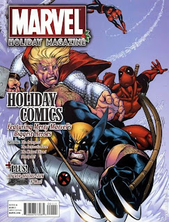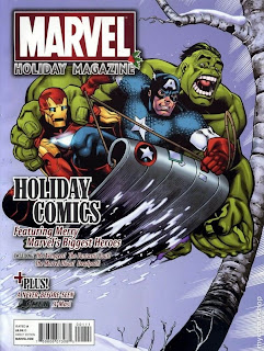

Here's what I saw in the magazine section of the grocery store today...

As near as I can discern, it's the exact same contents, it's just labeled as a "NEWSSTAND" version.
Personally, I prefer the (uncredited) John Buscema cover, but I'm obviously more of an old-school superhero fan anyway. The art is just repurposed from the old Giant Superhero Holiday Grab-Bag but what I find interesting is that cover has the characters smiling, whereas this year, they're grimacing. Spider-Man's left arm is also at a different angle.

I'm wondering if that was a change made back in 1974 and the artwork paste-ups fell off in the intervening decades, or if that was a contemporary change to reflect the lousy economy? I suspect the former, since there's some obvious clean-up work that could/should have been done on the new version but was not. (There are several residual marks on the page, notably around Thor. Shadows from white paint, perhaps, or part of some paste-up work that was originally done on the Thor figure?)
In any event, I know I certainly would not have given the magazine a second glance with either of those Ryan Stegman covers. (No offense to Stegman, of course, but he's no Buscema!) I'm glad I picked it up because it has some good old-school holiday comic stories, which I'm sure my nephew will appreciate when he gets this from Uncle Sean.


2 comments:
Ah, Marvel Holiday comics. I still have five or six holiday specials from the 1990s. Always enjoy pulling those out this time of year.
Boy, that original Buscema cover looks great, and so much more attractive than the repurposed contemporary item. I'm looking at them and looking at them, and I think there are various little factors, but I'm really starting to think that it's mostly the typography.
It fits with the art on the old cover like they belong together.
On the new one... ugh. That big white hole above the figures on the new edition is especially an eyesore.
Typography contest, Marvel 1974 vs Marvel 2010... and 1974 wins in a shock upset. Eeeesh.
Yeah, I didn't want to get into it in my original post, but the typography on the three new covers is pretty bad. I don't know who's working on composing Marvel's covers these days, but I've been decidedly unimpressed for the past couple of years. Some of the "Heroic Age" stuff I saw was abysmal.
Man, for the days when Marie Severin was doing cover layouts...
Post a Comment