I happened across a cover scan of
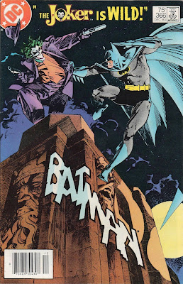
Batman #366. I don't think I've ever seen the issue before -- I certainly wasn't a regular Batman reader in the 1980s when it came out. Before I start talking about it, take a look so we're all on the same page...
As you can see, it's drawn by Walt Simonson and features Batman and the Joker fighter atop some gothic building against a cloudy, moonlit night. The "Batman" name is drawn into the building itself, no doubt inspired by some of the titles drawn by Will Eisner. But there's a problem with the cover art: it's cropped wrong.
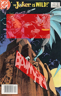
Take a look at where the primary focus is. It's the squarish section at the top centered on Joker and Batman. That's what deliberately designed to draw the reader's attention. Except it's uncomfortably off-center. You could whack off maybe a tenth of the right side of the image and not impact the visual in the slightest. It's totally dead space. Why would the art department do that? Take a look at this next image, where I've highlighted the main focus as well as the secondary focus: the title...
I think that right there is why it was cropped wrong. They've centered the layout around the title, not the figures. But despite being the whole real bit of white of the image, it's a
secondary focus for the illustration. They either were trying to "force" the reader to focus on the name over the figures, or they felt part of the branding meant the name had to be centered. I'm not sure if this was a decision by the art department who had to lay this out or from editorial who felt the title was more important than the image. Either way, it was the wrong decision.
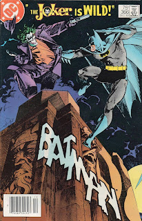
Here's my modified version...
Now, admittedly, the title does get close to the bottom of the page and I had to move Simonson's signature so it wasn't cropped off entirely but the oveall affect is a much more balanced cover. Plus it has the added bonus of Joker's gun reaching up into the header copy, additionally making the cover as a whole more of a holistic piece. Had I been able to work with the original art, the changes would've been even simplier
and there's a good chance there was more art to work with off to the left, which would allow for a little more leeway towards the bottom edge if there was concern about the title getting cut off. (Although you could knock off almost a whole inch off the bottom, and it'd still be perfectly legible.)
It's a really minor thing, and given the ever-looming deadline monster, maybe there wasn't time to fuss with it, but I came across the cover yesterday and it really bugged me.


1 comments:
Perhaps that vague sense of unease it elicits is intentional? I’m reminded of my studies of romantic era poetry in college. So much of it is written in iambic pentameter (each line being five metrical feet, each foot consisting of an unstressed syllable followed by a stressed syllable), that it’s easy to fall into this expectation that it should all be iambs. But deviations abound—frequently to emphasize word by breaking out of the pattern. When the rhythm leads you to expect an unstressed syllable and you get a stressed one instead, it kind of pops out more.
Anyway, different medium of course, but I wonder here if the unbalance is deliberate. They’ve already moved the name of the book and replaced it with “The Joker is Wild” — “Batman” is relegated to a splotchy scrawl on the building below. The characters are squeezed up at the top third of the page, and not only that, but the poses both feel unstable, like they are on the verge of falling off. The entire thing is deliberately unusual and uncomfortable. This is the Joker’s book now.
In short — the madman is on the loose, and these artistic choices subtly reinforce that.
Post a Comment