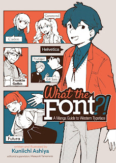
Marusu works in sales at a design agency. However, a last minute project needs to be finished up and all the actual designers are gone, so Marusu is roped in to do the work since she once said she can draw a bit. Seemingly in response to her confusion/frustration/building panic, Helvetica steps up to introduce himself. He then proceeds to take her to the Typeface Research Society. After giving her a crash course in some basic type-related definitions, he hands her off to Futura and Marusu then goes through the campus meeting a couple dozen different typefaces, learning a bit about them and their respective histories. She gets returned to the agency where her work on My Neighbor Helvetica is highly celebrated.
The central conceit of What the Font?! is that each typeface is personified, based on the central themes, ideas, and concepts behind each of the actual type designs. Helvetica is the most popular on campus, Arial feels like an insecure imposter next to Helvetica, Impact is a bit obnoxious and in-your-face, Zapfino is a dancer, Comic Sans is an otaku, etc. Each character only gets maybe 4-6 pages before Marusu is passed along to the next, so there's not a whole lot of depth to each of the characters, but mangaka Kuniichi Ashiya does an excellent job of mixing up things up. Despite each "chapter" basically containing an introduction and history of a different tyepface, he mixes things up so there's zero sense of repitition or redundancy. Each take feels fresh, like Marusu (and, by extension, the reader) really is on a whirlwind touring meeting all these characters in a short amoung of time.
The book itself has an incredible amount of structure to it. Each page after the five-page prologue consists of exactly four identical, vertically stacked panels. While the overall story flows from page to page, any individual page is virtually its own scene, and can almost stand independently. (For those unfamiliar, this is not an uncommon format in manga.) In the left margin of each page, there's an additional couple of sentences providing some details and/or trivia about the typeface seen on that page. And then at the end of each "chapter" there's a reference page with some basic info (who created it, when, etc.) as well as a two paragraph summary and a few notes about what well-known logos use that font as their basis. Then there's one page presenting the entire alphabet in that font, before we jump back into the story with the introduction of the next character.
With as many faces that are covered here, and trying to wrap that in a story format, it should come as no surprise that they don't get into a lot of the history or into any deep analysis of the designs themselves. That's not meant as a criticism by any means. This is very much presented as essentially a typography primer, and I don't think anyone going into this would expect anything beyond a broad overview. To that end, it does an excellent job. Particularly for people who perhaps aren't overly familiar with typefaces in the first place, but find themselves having to make font choices that they'd never really given any consideration before. They don't necessarily need to know tons of details about each of these faces; they just need to know what might be a better choice than Comic Sans for their resume.
I studied graphic design back in my undergrad days, and took more than a couple typography courses. This is by far the most entertaining book I've ever read about typefaces. I mean, I found myself chuckling through most of the chapter on Gill Sans because Marusu kept using the traditional "-san" honorific with him, thus calling him Gill Sans-san. You simply don't get that in most books about fonts.
The book came out from Seven Seas Entertainment late last year, and should be available wherever you get your manga these days. It retails for $13.99 US and is a worthy additional to your bookshelf whether you like manga or font design.
Now Available!
Blog Archive
-
▼
2021
(290)
-
▼
March
(26)
- What's Going on with Andy?
- What the Font Review
- Alice, Secret Agent of Wonderland Review
- Weekly Recap
- Upcoming Comics Calendar
- How Much Research Is Too Much?
- Robert Zuppke, Cartoonist?
- Punk Seth?
- The Original Infinity War
- Weekly Recap
- I Love the Smell of Old Comics in the Morning
- The Most Iconic -- but WRONG! -- FF Image
- Build an Army of 3D-Printed Supermen!
- The Origin of the Annual
- What Was Intended for FF #51?
- Weekly Recap
- Draw 50 Famous Cartoons As an Old Strip Primer
- Petty's Runnin' Down a Dream
- Buster Brown
- Tell No Tales Review
- AI-Created Comics
- Weekly Recap
- Upcoming Comics Events
- Lost in Translation
- What Comic Strips Can Teach Webcomics
- From Doorman to Micro-Face
-
▼
March
(26)


0 comments:
Post a Comment