Latest Posts

In the late 1970s, in an effort to capitalize on the relative success of the television show, Marvel started an Incredible Hulk comic strip. That the main character is called David Banner, and not Bruce Banner, is the key pointing back to the show of course. The scripts were credited to Stan Lee, and the art duties got shifted around to various artists like Larry Lieber, Rich Buckler, Alan Kupperberg, Ernie Chan and Frank Giacoia. The strip only lasted a few years (from October 1978 and until September 1982) and was retired with little fanfare as a minor point of Hulk trivia.

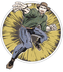
But I stumbled across this piece of ephemera, which has my brain cogs spinning...
Hulk Coloring Book
It's a 1980 coloring book featuring the Hulk. Except it's formatted like a comic strip. And pretty short with only sixteen pages. And while the illustrations aren't terribly elaborate, they do seem unusually detailed for a coloring book. The strips are credited to David Anthony Kraft (writing), Win Mortimer and Sal Brodsky (pencils), and Chic Stone (inking).

Given the timing and the format, my first thought is that it's artwork from the comic strip, just repurposed for this book. The "all new" starburst on the cover, though, suggests that these strips were never published before. Also, as far as I can tell, none of the creators here actually worked on the Hulk strip. So where did this come from?

My initial guess was that these were strips that were intended as a try-out for the comic strip, but veered too far from the newspaper characterizations and were rejected based on that. The comic strip itself was produced by Marvel. That they had a series of artists working on it suggests that it was farmed out to whoever was available, and were relying on the Hulk name itself as the selling point. With perhaps some additional emphasis on Lee's name as the face of Marvel. Of course, Lee's name went on a lot of material that he didn't write, and it was in fact Lieber who wrote the strip under Lee's byline for several months after Lee had actually stopped writing it.

The strip, as I noted, followed the characterizations from the TV show. The Hulk never spoke, and the antagonists were, by-and-large, not of the supervillain variety. In the coloring book, not only does the Hulk speak (much like the comics) but the storylines are much more in line with the comic books as he faces off against The Leader and The Rhino.

It's also interesting to note Mortimer's art here. While he did work at Marvel on occasion, particularly during the 1970s, he had never worked on the Hulk before (or since). But he HAD spent the better part of a decade years earlier drawing the Superman newspaper strip, so he was clearly comfortable with the format. He was also familiar with the TV-tie-in property idea, having worked on Spidey Super Stories.

One last thing to notice. I can't confirm whether or not this was actually published by Marvel, but it was almost certainly NOT published by Whitman. Which is noteworthy because Whitman was pretty much THE go-to publisher of licensed property coloring books at the time. In fact, any other Hulk coloring book from that period you will find bears a large Whitman logo in the corner of the cover. Why wouldn't they haven't published this one as well?

My theory is that Marvel first pulled together these strips in early 1978 to shop around as a tie-in to the TV show. They got Kraft (who seemed to be the ubiquitous Marvel writer of the late 1970s) to write a few weeks' worth of material and pulled in Mortimer as someone familiar with the comic strip format/pacing. After taking it to a syndicate or two, they got feedback saying something to the effect of, "Sure, great idea! But this doesn't look like the TV show at all. Make it more like that and we'll buy it." So they went back to Lieber for the rework, with Lee getting pulled in for some name recognition. Kraft's and Mortimer's strips were left lying around for a couple years before someone had the coloring book idea to make at least some money off this already-produced-and-paid-for artwork. Whitman probably wouldn't do it since A) the stories are too short, and B) the format is radically different than the 8x10 size they always go with. It simply wouldn't fit in with the rest of what they were already set up to work on. Marvel put it together in some other package (it originally came with a set of markers as well) and hopefully managed to at least recoup some of their losses before this fell into the scrapheap of transient superhero tie-ins.
Bronze Age Babies posted a tweet yesterday simply sharing these four Marvel artist self-portraits...
I've been reading and researching Marvel comics for decades and now, and I've seen all these images before. But I don't think I've ever seen them together in such close proximity like this. And what that does is invite much more direct comparison.

Now you could study them for style and form and line quality and whatnot. But you can do that with essentially any of these artists' work. What I think we can look at here, somewhat more uniquely, is how the artists portrayed themselves in relation to these characters.

Jack Kirby, of course, created most of the characters he has depicted around himself. In his image, the characters are almost all leaping off the very page he's drawing. They're running/leaping/flying away from Jack and (primarily) towards the viewer, while Jack himself is actively working at his drafting table. Which, if you look closely, is actually floating a foot or two off the floor! Jack was focused on his work; it sprang out of him so fast and so violently, yet he himself seemed scarcely aware of what was going on around him. He's surrounded by all these action heroes -- and let me emphasize the action involved here -- as they are unleashed from his hand.

Next we've got John Romita. His focus is a little more Spider-Man centric, but more notably, the image has a very different tone to it. Things are much softer and more dream-like. Romita himself is in a daydreaming-esque pose, there's plenty of fluffy clouds from Mysterio and Green Goblin's glider, and Gwen is literally dreaming about Peter Parker... who bears quite the resemblance to John here! Overall, the figures are less action-oriented. They're surrounding him and, while he's still seemingly oblivious to their presence, they're very much focused on him. There's a greater intamcy and familiarity with all of them.

Now Marie gets back to a more action-oriented image. Her interaction, though, is somewhat removed. She's standing apart from everyone, using a more remote tool (a camera) to capture their presence. Very much contrary to John's approach above, she's drawn herself considerably smaller than everyone. It's as if she views herself as relatively insignificant compared to the characters' presences and only as someone who documents their actions. Further, the juxtopisition of the menacing poses with her "nice big smile" dialogue comes across as something of acknowledgement that for all their fervor, these characters are still fictional and not to be taken that seriously.

Finally, we've got John Byrne's piece. His text addition here makes things more explicit than the others. Unlike the previous creators, John's grown up with (most of) these characters; they're the heroes he looked up to. It less about who they are or what they do -- the others show the characters doing something to at least suggest their powers; John's cast here is just standing there -- and more about what they mean to him. The're surrounding him and looking at him with some mixture of love and pride. There's a more reverant quality to the image. They're protecting him, but in an emotional manner, not a physical one. You might note, as well, there are no villains in this image. (Well, at least, none of them were villains at the time this image was drawn!)

None of their approaches here are more right or wrong than any others. They're all great images, and there's plenty of reasons for fans to geek out over them. But beyond that, I think they do speak to the connections these artists had/have to the work they produced for Marvel and the characters published by them, and says as much about the creators' different approaches as anything else.
The Making of Farewell to Kings
By something of a coincidence, I happened to recently pick up both Rush: The Making of Farewell to Kings from late last year and Rock 'n' Roll Comics #60 (about Genesis) from 1993. As they're both basically limited histories of musicians, it's virtually impossible not to make comparisons.

I should probably start by saying that Rush and Genesis (particularly their 1970s era) are my favorite bands. I'm a fan of progressive rock generally, and they were the earliest introductions to the genre. I'll also say that I have a background as a drummer, and Phil Collins and Neal Peart were two of my earliest influences. So I'm coming to these comics with more than a passing familiarity with their music. And I suppose that's actually why I haven't spent more time checking out music-related comics biographies -- I've always assumed that the complete lack of an audio component would inherently limit the ability to relay the story effectively. Although, to be fair, that assumption is largely based on when I've seen music and bands portrayed in comics that were NOT expressly focused on the musicians or the music itself, and those interpretations were always pretty awful.

The challenge for relaying the stories of these bands, in any form, lies largely with their longevity. Both were formed in the late 1960s and kept producing new music for nearly a half century. (Although they have another tour planned for later this year, the last Genesis album of new material was in 1997. Rush kept producing new work through 2012 and continued touring until 2015; however, Peart passed away last year.) What both of these books have smartly done is make their focus considerably more finite. The Genesis biography concentrates on the 1970s (technically 1969-1980) and the Rush book, as the title explains, centers exclusively on a single album. Even with those limitations, the pages fly by, albeit for slightly different reasons curiously. The Genesis biography is only 30 pages and I know a lot of material gets glossed over -- they go from Collins taking over as lead singer to guitarist Steve Hackett quitting in about two pages. In The Making of Farewell to Kings, there's 144 pages for the one album, so there's certainly plenty of room to tell the story. It goes quickly, though, because they put a lot into atmospheric art, with a number of colorful splash pages with minimal text. The two books are at opposite ends of the spectrum in that regard.

Rock n Roll Comics #60
One of the challenges with any biographic type artwork is capturing individuals' likenesses. Particularly in a comic where the people have to be drawn recognizably and consistently across the entire work. Juan Riera and Ittai Manero do an excellent job capturing Rush's likenesses. While the drawings are cartoony, borderline caricatures, they're pretty consistently and readily identifiable. They even took up the additional challenge of showing both the band as they were in 1977 and as they looked in 2018 (used repeatedly for some framing sequences). Greg Fox's depictions of Genesis are a bit more hit-and-miss. Some panels show spot-on likenesses, and others you can't tell who you're looking at. Granted, depictions like that can be particularly challenging, as I said, but I think a writer has to be particularly careful to ensure their script identifies who is who if the art fails to do so at any point.

The writing styles are markedly different between the pieces as well. Jay Allen Sanford wrote the Genesis piece largely as a straight-forward comic book narrative. The dialogue isn't perhaps always the most natural, but it is used to move the story along. Sanford doesn't shy away from captions but tends to use those more specifically for relaying how well albums sold or how individual songs charted. David Calcano and Lindsay Lee use dialogue more expressly to relay character, and captions are reserved for pushing the broader narrative. While they're mostly pretty restrained in that respect, the first 15-20 pages are a bit caption-heavy as they provide background and context for where Rush was going into making their 1977 album.

Of the two books, I definitely prefer The Making of Farewell to Kings -- they're able to get more in depth and (somewhat ironically) don't rush the story. They provide a lot of atmosphere in addition to relaying the actual events. Rock 'n' Roll Comics seems more... "perfunctory" is the word I keep gravitating to, but that's not really right. It comes across more like its production was just a job -- last month was Eric Clapton, this month it's Genesis, next month it's Elton John. Do this issue and move on to the next. It's not bad -- certainly for the time and the publisher -- but it feels more manufactured than created. But that said, I figure these types of comics -- biographies about musicians -- are conceptually hard in general. You've got to create something with broad enough appeal for the comics market, but interesting and detailed enough for the fans of the musicians. There's a handful of musicians who are probably broadly liked enough that you can more readily go in either direction (folks like the Beatles or David Bowie) but for most, I think you'll find yourself trying to straddle that line. Rock 'n' Roll Comics seemed to strike that balance reasonably well, considering the series ran for 65 issues over about four years. The Rush book seems more directed towards its fans, given the level of detail the get into, but they still provide that introduction for those who aren't as well-versed in the band's history.

Honestly, I'm still not convinced about music biographies in comics format. I know it's easier than ever nowadays to call up any song that I could play in the background while I'm reading, but particularly for bands that I already enjoy, I find I get lost in the music itself and can't pay attention to the book. I do really enjoy comic biographies generally and, if they come out with another Genesis or Rush one, I'll probably get it -- maybe King Crimson, too -- but it's definitely not a sub-genre I plan on spending a lot of time seeking out.
In the 1955 movie Artists and Models, Dean Martin and Jerry Lewis portray a couple of guys working in the comic business. Martin is an artist, and Lewis is an accidental writer. Accidental in that he mumbles stories out loud while he's sleeping, and Martin's character uses them as plots for his comic work. Their main character is a superhero called Bat Lady, who quickly gains a Superman-level of success and we see any number of Bat Lady pieces of art throughout the film. Not only what Martin is working on, but the publisher's office sports a giant Bat Lady mural and the publisher himself wears a Bat Lady tie.

Except nowhere in the movie's credits does anyone actually receive a designation for creating the actual art. Arthur Camp and Neil Wheeler are given props credits in IMDB, but there's nothing in the movie itself.

A few years back, Bonhams auction house announced that they had three pages of original art used as props from the movie.
They credited the work to either Camp or Wheeler, though I suspect that came from the same IMDB search I conducted.

Credits aside, it's fascinating to see how the artwork was laid out. (There's never a clear shot of the pages in the film.) Doubly-interesting to see is how two guys who weren't necessarily familiar with comic art production put togther the pages.

Curious aside: Two years later, Camp found himself creating props for another picture starring Lewis called The Sad Sack... based off the comic book character of the same name created by George Baker.
Here are this week's links to what I've had published recently...

Kleefeld on Comics: Alice, Secret Agent of Wonderland Review
https://ift.tt/31rLHdV

Kleefeld on Comics: What the Font Review
https://ift.tt/3sAFmbV

Kleefeld on Comics: What's Going on with Andy?
https://ift.tt/39sZXau

Kleefeld on Comics: Blondie Promotes Mental Hygiene
https://ift.tt/3dqbJ6H

Kleefeld on Comics: DC's Comicmobile
https://ift.tt/2PlvowR


Comicmobile
The gent on the right in this image is Bob Rozakis, formerly a writer and production director at DC Comics. That's his wife on the left. Behind them is DC's official Comicmobile.

In the early 1970s, DC's vice-president Sol Harrison had the idea for a van that would drive around the suburbs selling comics in much the same way an ice cream truck would sell frozen treats. Recall that this is just as the direct market was starting and dedicated comic shops were pretty rare, so publishers were still willing to try a variety of different methods to sell more comics. Harrison got a hold of a van, painted "Here comes the comicsman!" on the side and slapped a bunch of commercially available stickers of DC's characters on the sides. He then sent Michael Uslan (the same one who went on to produce the Tim Burton Batman movie) out to the suburbs of New Jersey with the van stocked with leftover material from the in-house library. Uslan would drive around to local beaches and parks and such, ring some bells out the window, and sell comics out of the van.

This would have been the summer of 1973. When Uslan had to go back to school in the fall, the van was turned over to Rozakis. Instead of driving through New Jersey, though, Harrison decided they should try Long Island, New York. Rozakis took a train out to Jersey, and then drove the van back.

However, what Rozakis quickly discovered, though, was that the legalities of selling were a bit different in New York. In the first place, he had to get a vendor's license for each of the townships he would be selling in. In the second place, none of them allowed him to stop in local beaches and parks, where Uslan seemed to have the most success. So he had to simply drive up and down the streets of Long Island, hoping to attract some passing attention with the bells he held out the window.

It's not terribly surprising that sales were absymal. Rozakis claims he barely made enough money to cover gasoline expenses. (And this was back when a gallon of gas cost the same price as a comic book -- a mere 20¢!) Interestingly, though Uslan's best-seller was Plop #1 which had just recently come out, and Rozakis says #2 sold very well (compared to everything else) when it came out while he was driving. But the sales did not justify the experiment and Rozakis was called back into the DC offices after about six weeks.

The van was sold/traded/given to Bruce Hamilton, later the publisher of Gladstone Comics. He tested the Comicmobile concept in Arizona for a few months. (I can't find any record of how successful it was there, but I suspect not very.) The van ultimately was demolished when it was hit by a semi.

The experiment was such a failure that no one seems to have seriously considered repeating it. One could argue (easily) that Harrison's plan was a little too loose on the details, and wasn't given sufficient planning and/or funding. One could argue that it wasn't given enough time to develop; Rozakis has noted that most of his clients were regulars, much like a local comic shop. One could argue that the market was radically different fifty years ago. So maybe a comicmobile today would have much better results; whoever wants to try this again, I wish them far better luck than Uslan, Rozakis and Hamilton had!
There was a BBC documentary from 2002 called The Century of the Self in which they detailed how the basic teachings of Sigmund Freud influenced mass consumerism. There's almost a direct line between Freud himself and "public relations" and from there to modern marketing. It's a fascinating piece of film, and worth seeing for a better understanding of how you're coerced into buying a bunch of crap you don't need. There entire thing (roughly four hours!) is available on YouTube here.

Now, why I'm bringing this up on my comics blog is this screen grab in particular...
The narrator doesn't actually refer to Blondie and Dagwood specifically, instead casually glossing over it with a general "publications from the New York State Department of Mental Hygiene" type of label but it's clearly showing a promotion from 1950 that was highlighted over at Comic Book Legends Revealed a few years back.

One of the things I find interesting here, beyond the simple fact of the comics' existence, is that it evidently was featured in some video material from that time period as well. It wasn't just a publication that was printed up and sent out to doctor's offices or wherever. It was filmed as part of a promotion, probably shown to psychiatrists to encourage them to hand out a variety of material.

That original film was undoubtably short and forgetable. Even moreso than the comic itself. So I'm amazed that it manages to survive in any fashion. I have to wonder how many other snippets of film are out there like this highlighting other comics that are scarcely remembered these days?