
 Here are this week's links to what I've had published recently...Here are this week's links to what I've had published recently...
Today is No Pants Day!
Over 25 cartoonists are drawing their characters without trousers and urging readers to donate clothing to thrift and second-hand stores hard-hit by COVID-19. Here's an AP article with more details.
Although the press release claimed there were 29 participating comics, there were around a half dozen that were listed as participants that I could see no joke, dialogue, or concept that remotely tied to
the theme. Interestingly, there are more jokes about how some characters don't normally wear pants anyway than there are jokes about how people aren't wearing pants because they've been working from home during the pandemic.
But from here, I'm just going to go through and share the comics themselves...


OK, as I said, the front cover isn't very visible. Gray keeps it rolled up before she hands it to Schroder and, when Schroder takes it and opens it up, he keeps the back of the issue facing the camera. Fortunately (for my purposes here, at least) the ad on the back cover is pretty recognizable. It showed up on and in a number of both Marvel and DC books right around the time I was seriously getting into comics. You can watch the clip yourself from the link above, but the ad being shown is obviously this one...

(As a complete aside, that episode does feature a young Jason Bateman, who was a somewhat regular cast member for the show's first two seasons, and -- more interestingly -- a 24-year-old Sharon Stone!)
Going through my collection, there are exactly four Fantastic Four issues that feature that Lego ad on the back cover: #248-251.


And from what little of the front cover we can see, that doesn't seem to match the visuals of any of the FF covers that included that Lego ad. The comic they used on the show seems to feature a lot of reds and yellows, including what appears to be a large yellow banner above the logo. Definitely larger than the "Marvel Comics Group" banner most Marvel titles sported around that time. My original thought was it was one of those cover blurbs/ads announcing a Toys 'R' Us contest, but those ads ran in 1980. There were some similar ads that ran in 1982 for a ten-speed bike contest, but A) those were at the very start of the year and B) the ones on the FF issues at least were primarily black and green. Plus all those issues seemed just old enough that it would've been too much of a pain to (in 1982) track them down unless they really wanted to be accurate to the script and, as none of those issues feature the Hulk either, that struck me as really unlikely.
Going back to that ad. In going through the rest of my collection, I could confirm the ad also appears on the back covers of Avengers #225, Daredevil #190, Captain America #278, Conan #2, Weird War Tales #117, and Wolverine #3. But here again, none of the cover visuals seem to line up with what we do see in the episode. Avengers #225 does have a lot of yellow across the top, but there's almost no red anywhere on the cover at all.

That it's a Spider-Man comic with no trace of either the FF or the Hulk would explain why Gray keeps the issue rolled up, and why Schroder only really displays the back cover. They're trying to hide the fact that the prop doesn't match the script. I suspect someone in the prop department thought the NBC logo on the cover was a nice touch and that was more important than the Fantastic Four or Spider-Man or whomever. From a story perspective, the comic's only purpose is an excuse to have Gray enter the room, interact briefly with Schroder, and leave. What issue it actually is is irrelevant. But that prompts me to ask: why not adjust the dialogue to match the prop? "That issue of Spider-Man where he fights Tarantula" would work just as well in this context, and then you wouldn't have to have the actors and camera operaters trying to dance around a stupid -- and ultimately inconsequential -- discrepency.
As a Fantastic Four fan, I appreciate the shout-out to my favorite superhero comic, but it literally took more effort on their part to get it wrong than it would have to get it right.
Carl Thomas Anderson is the cartoonist behind the comic strip, Henry. He had actually created other strips before then, including Raffles and Bunny and Herr Spiegelberger, the Amateur Cracksman. He freelanced for Judge, Life , and Puck. In 1935, he wrote How to Draw Cartoons Successfully which was republished repeatedly over the next decade. Throughout all of this, Henry was unquestionably his most successful cartoon, but it's clear that, despite not really taking up drawing until his 20s, he worked hard at it throughout his lifetime.
But one of the things that often gets lost when discussing cartoonists from Richard Outcault to Charles Schulz to Stephan Pastis is their lives outside of cartooning. These people are all multi-faceted individuals, and pursue interests beyond what they're famous for. Even in David Michaelis' comprehensive biography Schulz and Peanuts, he continually resorts to tying the events in Schulz's life to what happened in the strip.
So it's kind of interesting to come across items that aren't directly related a cartoonist's comic strip. In the case of Anderson, he actually holds a design patent in the U.S. for a desk he created. He was actually a carpenter before becoming a cartoonist and used those skills in his 50s to craft a different design for a desk. The patent filing isn't terribly elaborate in its description, but it includes a wondefully done illustration...
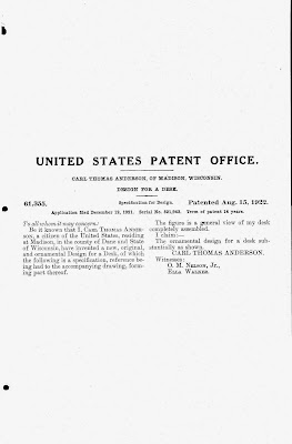

My best guess is that it doesn't "fold", so much as "come apart easily." I suspect the legs and the drawing surface itself aren't actually connected, but are held in place with friction and gravity. This would certainly require a bit more ingenuity and craftsmanship than simply screwing the pieces together, and points to Anderson's continued interest in carpentry decades after he supposedly would have given it up.
Not a huge discovery, but a fascinating contextual one that puts a more colorful light on someone who might otherwise be thought of as just a cartoonist.
One thing I've found fascinating over the years is how pretty much every country with a comics industry experienced a backlash against the medium in the middle of the 20th century. How exactly that manifested, of course, varied depending on the politics of the country at that time, but that there was some decided negative attention given to the medium is striking. Superhero comics, for example, were banned in Hungary during its communist regime, in part because of Fredric Wetham's arguments in Seduction of the Innocent, which were echoed and expanded upon. The first superhero books weren't published in the country until 1989 when it was on the verge of becoming a democracy.
But here's the REALLY weird bit: the first superhero comic that was published in Hungary was...
Does it seem to be a really unusual choice to anyone besides me? I mean, I can see the potential appeal because it's got a lot of characters in it, which might mean something legally or could be used to test readers' reactions to different characters, but I think they could've picked other stories using those criteria that were better/more powerful. I'm not knocking Revenge of the Living Monolith -- it wasn't a bad story, and it holds a soft spot in my heart as the first "graphic novel" I ever got -- but it doesn't seem like a really great choice either. What about FF vs. the X-Men? Or Secret Wars? Contest of Champions? Or just about any story arc from Roger Stern's Avengers?
Again, Revenge of the Living Monolith wasn't bad, but I'm just saying it's not the story I would've led with and I can't imagine what the thought process was that led to that particular decision.
But here's the REALLY weird bit: the first superhero comic that was published in Hungary was...

Does it seem to be a really unusual choice to anyone besides me? I mean, I can see the potential appeal because it's got a lot of characters in it, which might mean something legally or could be used to test readers' reactions to different characters, but I think they could've picked other stories using those criteria that were better/more powerful. I'm not knocking Revenge of the Living Monolith -- it wasn't a bad story, and it holds a soft spot in my heart as the first "graphic novel" I ever got -- but it doesn't seem like a really great choice either. What about FF vs. the X-Men? Or Secret Wars? Contest of Champions? Or just about any story arc from Roger Stern's Avengers?
Again, Revenge of the Living Monolith wasn't bad, but I'm just saying it's not the story I would've led with and I can't imagine what the thought process was that led to that particular decision.

Prior to finding this, I didn't know anything about Chase. But Emilie Dietrich Griffin provides some information about him in the Foreword citing, among his other achievements, that he "created a new form" with this strip. "He's taken a rich vein of Louisiana history, national history, international history—all the political struggles that went into the making of a territory and a nation and a continent, and told it from both a historical and an editorial cartoon viewpoint."
Except cartoonist Jim Baker did that with Ben Hardy & the Ohio Adventure a year earlier. John Rosenfield Jr. and Jack Patton did that with Texas History Movies in the 1920s. I haven't done much (any, really) research on these types of strips, but Griifin's assertation is proveably false with minimal effort.
And I bring that up because that's how much of Chase's version of the Louisiana Purchase reads the same way. Earlier this year, I looked at Chucky Jack's A-Comin' -- John Sevier's 1956 book on the founding of Tennessee -- and complained that Chucky Jack was presented in such a heroic, can-do-no-wrong fashion that it's impossible to believe the story is remotely accurate. I felt the same way here. Americans are always proud, strong, and heroic while literally everybody else is weak and cowardly. Native Americans are stereotypical savages, and Black people are absent. (I could find exactly one Black person drawn anywhere in the book -- a passing reference to Meriwether Clark's slave York. And it's in literally the very last panel, as part of a six page epilogue Chase added in 1982.) The story told by Chase here is basically a slightly expanded version of the bullshit that's in US grade school textbooks.
Further making things frustrating, Chase isn't a very good cartoonist. His illustrations are decent enough -- even if they're somewhat inconsistent in style from one panel to the next -- but the storytelling is awful. There's no real narrative to the story; it's almost like a series of only-tangentally-related vignettes. And it's only just barely comics -- much of it is closer to illustrated prose. And frequently very heavy on the prose to boot! It's honestly not an especially long book, but it took me several months to get through because I had to keep setting it aside after only a couple pages because I kept getting annoyed at trying to work my way through each panel.
Of the various "state histories presented in comics form" comics I've read, this is easily the bottom of the barrel. It's perhaps not quite as obviously false as the Chucky Jack story, but the lack of skill with which Chase tries to tell the story doesn't even make the myths here engaging, which strikes me as cardinal sin number one when it comes to storytelling. How this got reprinted as often as it did, I have no idea.
Yesterday, Marvel and Penguin Random House hosted a brief session online to address comic shop retailer questions and concerns about PRH becoming Marvel's distributer. I don't think there was anything wildly earth-shattering or surprising, mostly just a few clarifications and the underling basic idea that PRH is going to be as good a partner as they can be. I haven't looked but I expect the regular comic news outlets have covered the substance of the meeting sufficiently well.
But there's an interesting (and wholly inconsequential) detail I happened to catch that I suspect most everybody else will miss. Here's a shot of Marvel's publishing Vice President, David Gabriel... Pretty typical Zoom-style shot these days, right? Clearly a home office/living area with the appropriate accoutrements: bookshelf, couch, TV, reflections of the window in his glasses... A lot of people look at these types of shots these days and make something of a game of figuring out the specific titles on the bookcases. I can't make any out, but I expect many of them are Marvel titles.
However, there are two items I can make out pretty clearly that I'd like to draw your attention to. In the upper right of the screen , there are two framed posters on the wall. The lighting make them a bit hard to decipher if you're not already familiar with the images but, as it happens, I know both posters quite well. One of them I had on my own bedroom wall for years when I was growing up and another was one that I spent many years in my childhood on the hunt for. Here are two clearer images of them...
 Both are posters of the Fantastic Four, drawn by John Byrne. The first image was made during the middle of Byrne's run on the title and highlights effectively every character that debuted in the first 100 or so issues. The second image is part of a short promotional series put out by Coca-Cola a few years earlier. Byrne had also drawn written/drawn two full issues as part of the same promotion, but Coca-Cola rejected them as being too violent and they ended up getting published as Fantastic Four #220-221. Byrne would take full control of the title about a year later.
It's hardly surprising that Marvel's VP of publishing would be a fan of some of the characters. Or would at least want to present the appearance of being a fan if you're feeling cynical. But those aren't just any two Marvel posters. He either got them new 35-40 years ago and has held on to them since, or he more recently spent some time and money tracking down still-decent copies. I haven't seen that Coca-Cola one sell for less than $50 in decades, and that's for a poor condition copy. Decent copies easily get into the hundreds of dollars range. Which I'm sure Garbiel could easily afford, but if you just want to have a cool FF poster in your room, that's not going to be the approach you're going to take.
No, I'm pretty sure this identifies Gabriel as not only a fan of the Fantastic Four, but one who grew up on Byrne's version back in the '80s. Not that anyone was necessaily looking for it, but those posters are some pretty solid geek cred if you asked me.
But there's an interesting (and wholly inconsequential) detail I happened to catch that I suspect most everybody else will miss. Here's a shot of Marvel's publishing Vice President, David Gabriel...

However, there are two items I can make out pretty clearly that I'd like to draw your attention to. In the upper right of the screen , there are two framed posters on the wall. The lighting make them a bit hard to decipher if you're not already familiar with the images but, as it happens, I know both posters quite well. One of them I had on my own bedroom wall for years when I was growing up and another was one that I spent many years in my childhood on the hunt for. Here are two clearer images of them...


It's hardly surprising that Marvel's VP of publishing would be a fan of some of the characters. Or would at least want to present the appearance of being a fan if you're feeling cynical. But those aren't just any two Marvel posters. He either got them new 35-40 years ago and has held on to them since, or he more recently spent some time and money tracking down still-decent copies. I haven't seen that Coca-Cola one sell for less than $50 in decades, and that's for a poor condition copy. Decent copies easily get into the hundreds of dollars range. Which I'm sure Garbiel could easily afford, but if you just want to have a cool FF poster in your room, that's not going to be the approach you're going to take.
No, I'm pretty sure this identifies Gabriel as not only a fan of the Fantastic Four, but one who grew up on Byrne's version back in the '80s. Not that anyone was necessaily looking for it, but those posters are some pretty solid geek cred if you asked me.


