

 Here are this week's links to what I've had published recently...Here are this week's links to what I've had published recently...
I was doing some research on another book several years ago, and stumbled across this ad running in the middle of one of the comics... Now this was from 1948 -- before the Kefauver hearings or Seduction of the Innocent and all that -- but it still caught me off guard a bit. The cloaked dude looks like he just pulled that blade out of the cop's bleeding chest. The officer's head and arms look twisted in an unnatural manner as well. It's not really a gory image per se, but it's still fairly explicit. Especially with the word "CORPSES" taking up a good chunk of visual real estate nearby.
I was curious: was this a real book? Was this actually published? Or was the ad something the publisher just threw out there to gauge interest?
Turns out it was a real book all right... What struck me, though, is that the cover has a less graphic image. Namely, the office is not shown with a puncture wound or blood. The tip of the blade also seems to have shortened a bit in the ad. I tend to think the wound was edited out for the cover, rather than added for the ad. The cop's uniform is shown with wrinkles and folds throughout, but the area over his heart on the cover is strangely undetailed. Perhaps they felt it looked too gruesome when the blood was actually colored red.
The series was actually called Ideal and "The Corpses of Dr. Sacotti" was the first story of issue #2. The first issue debuted with "Antony and Cleopatra" but there was a clear indication that the editors/publishers thought the Sacotti story would be a hit. Here's a two page ad (courtesy of Atlas Tales) from Ideal #1 also promoting the story...

Curiously, it seems it was issue #3 that drew more ire. It featured historical accounts of Joan of Arc and the Second Boer War, but The Evening News of London claimed the editors had an "anti-British slant." Issue #4 focused on Richard the Lion-Hearted, but #5 changed the format to love stories, even changing the logo to read "Ideal Love and Romance." Issue #6 was entirely retitled Love Romances.
From "The Corpses of Dr. Sacotti" to "Hearts Dance on High!" inside of a year!

I was curious: was this a real book? Was this actually published? Or was the ad something the publisher just threw out there to gauge interest?
Turns out it was a real book all right...

The series was actually called Ideal and "The Corpses of Dr. Sacotti" was the first story of issue #2. The first issue debuted with "Antony and Cleopatra" but there was a clear indication that the editors/publishers thought the Sacotti story would be a hit. Here's a two page ad (courtesy of Atlas Tales) from Ideal #1 also promoting the story...


Curiously, it seems it was issue #3 that drew more ire. It featured historical accounts of Joan of Arc and the Second Boer War, but The Evening News of London claimed the editors had an "anti-British slant." Issue #4 focused on Richard the Lion-Hearted, but #5 changed the format to love stories, even changing the logo to read "Ideal Love and Romance." Issue #6 was entirely retitled Love Romances.
From "The Corpses of Dr. Sacotti" to "Hearts Dance on High!" inside of a year!
Back in 1984, apparently to compete with Kenner's Super Powers and Mattel's Secret Wars action figure lines, Remco obtained the license for and produced a small run of figures based on Archie Comics' Mighty Crusaders!

Michael Neno pointed these out recently on a Facebook post, and I was genuinely surprised I don't recall ever hearing about these. I was never a big Crusaders fan, but they were apparently sold primarily at Kmart, which was a store my family frequented a fair amount back in the '70s and early '80s. (They were cheap, very close, and frankly there weren't many other options we could reasonably get to back then.) So even though I didn't read any Crusaders comics, I was in the Kmart toy aisle pretty regularly in 1984-85. It's possible I did see them and dismissed them out of hand as cheap knock-offs because the production on these is, by all accounts, inferior.
You can clearly see the figure proportions are awkward. Like they were aiming for mimicking the broad/squat He-Man figures, but those figures, while not realistically proportioned, were proportioned well unto themselves. Here, the heads are too big, while the legs are far too short and narrow, and connect at the hip uncomfortably. Not to mention just being crudely sculpted with sloppy paint jobs. Not that Remco was ever known for producing high-quality toys! And when they were competing directly agaist better quality figures from Kenner and Mattel, who had more popular licenses, it's no real surprise these figures found their way to the discount bins really quickly.
(As an aside, Remco was no stranger to comic book licenses. They had produced the "Energized Spider-Man" in 1978, "instant" Hulk muscles in 1979, Sgt. Rock and Warlord action figure lines in 1982, and Crystar action figures in 1983. The Warlord figures more closely resemble the He-Man proportions, so I can't imagine how/why they missed so badly on the Crusaders. They literally could have re-purposed the Warlord bodies mold and been miles ahead, both in terms of sculpting quality and cost savings!)
While the Mighty Crusaders as a group didn't appear until late 1965, some of the individual characters date back to the early 1940s. Interestingly, the original characters were largely born out of the desire to ride the coattails of the success of Superman and Batman. When they were brought together as a team in 1965, it was done because of the success of The Justice League of America and The Avengers. That 1960s title lasted a scant seven issues (with a few appearances in other comics) before it was cancelled. The title was brought back in 1983, apparently designed specifically to promote the upcoming toy line, much the way Secret Wars was developed. That version lasted thirteen issues. A 1992 series lasted eight issues.
 It would seem that the Mighty Crusaders, always trying to follow trends and seemingly never trying anything that isn't derivative, is always behind the curve enough that they're never very successful. Both in comics and in action figures.
There is one interesting thing of note to comic fans about these otherwise pedestrian and generally unremarkable action figures. The illustrations on the back of the card showcasing the entire figure line were by none other than Steve Ditko! I daresay this is the best these heroes ever looked! Thanks for bringing all this to my attention, Michael!

You can clearly see the figure proportions are awkward. Like they were aiming for mimicking the broad/squat He-Man figures, but those figures, while not realistically proportioned, were proportioned well unto themselves. Here, the heads are too big, while the legs are far too short and narrow, and connect at the hip uncomfortably. Not to mention just being crudely sculpted with sloppy paint jobs. Not that Remco was ever known for producing high-quality toys! And when they were competing directly agaist better quality figures from Kenner and Mattel, who had more popular licenses, it's no real surprise these figures found their way to the discount bins really quickly.
(As an aside, Remco was no stranger to comic book licenses. They had produced the "Energized Spider-Man" in 1978, "instant" Hulk muscles in 1979, Sgt. Rock and Warlord action figure lines in 1982, and Crystar action figures in 1983. The Warlord figures more closely resemble the He-Man proportions, so I can't imagine how/why they missed so badly on the Crusaders. They literally could have re-purposed the Warlord bodies mold and been miles ahead, both in terms of sculpting quality and cost savings!)
While the Mighty Crusaders as a group didn't appear until late 1965, some of the individual characters date back to the early 1940s. Interestingly, the original characters were largely born out of the desire to ride the coattails of the success of Superman and Batman. When they were brought together as a team in 1965, it was done because of the success of The Justice League of America and The Avengers. That 1960s title lasted a scant seven issues (with a few appearances in other comics) before it was cancelled. The title was brought back in 1983, apparently designed specifically to promote the upcoming toy line, much the way Secret Wars was developed. That version lasted thirteen issues. A 1992 series lasted eight issues.

There is one interesting thing of note to comic fans about these otherwise pedestrian and generally unremarkable action figures. The illustrations on the back of the card showcasing the entire figure line were by none other than Steve Ditko! I daresay this is the best these heroes ever looked! Thanks for bringing all this to my attention, Michael!

Well, it will only make sense if you know several things. First, you need to know what radicalism and toryism are. I suspect most folks could guess at radicalism, and assume toryism would be the opposite of that, but that still might be a stretch. Next, you'd need to know what that the subject of the cartoon is performing a Scottish sword dance and, more significantly, you'd need to have seen such an act performed to really understand what's involved in it. Third, you'd need to know that the illustration is of William Gladstone and that, fourth, he was Prime Minister of England at the time the cartoon was drawn. And even then, it would still help to know what platforms he stood upon and what speechs he had given in the latter half of that year.
The cartoon, by itself, for most people simply doesn't make much sense today. It's a just a Scottish guy stepping over a couple of swords. Even after several setences of explanation (see above), it's still doesn't carry much context, despite the incredible execution of the final product and the probably-super-poignent topicalness that it would've had in 1871. But the base of reference is too far removed at this point, and the cartoon doesn't make much sense, let alone seem funny.

I had a related discussion on Twitter where someone was saying that if you assumed the cartoon was by an anti-mask wearing, right-wing cartoonist, he could see how someone might mistake the intent. My argument, though, is that you're still deliberately mis-reading the cartoon if you take that approach. The science behind mask-wearing is over-whelming. For a character to be so flippant about it, the reader can only take this one of three ways:
- You can read the cartoon as intended
- Cynically, you can read the cartoon as intended, but actively choose the wrong interpretation for the sake of trashing the cartoonist
- You can be willfully dimissive of the science; the extension of which is that you will be willfully dismissive of the cartoon
Context is every bit as imporant in a cartoon as the content itself. If you misread Xunise's cartoon, you're doing it deliberately. Either by willfully misunderstanding the context, or by willfully misunderstanding the content. And, once again, either way, you can fuck off because you're part of the problem!
I was originally going to dash off a kind of quick, snarky piece today about how the mascots for Comic-Con International and WMMS radio out of Cleveland could be brothers...

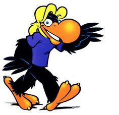
 First, the Toucan, though. Rick Geary moved to San Diego in 1975. He began working on comics and was a regular contributor to National Lampoon, and later had work published in Heavy Metal. Not surprisingly, he became somewhat involved with Comic-Con and, in 1984, came up with a toucan character to be used on letterheads and other stationery. Geary has noted, “At the time, I was big into animals in human clothing, so I drew this generic big-beaked bird, never intending it to be a toucan. Also, I understood at the time that this was just to be used for a few things. I had no notion of it becoming Comic-Con's permanent logo.” But it got to be used more and more, the illustration getting streamlined in the process and, though, in 1995 CCI adopted the "eye" logo they still use today, the toucan (whose name, as far as I can tell, is "Toucan") has continued to show up in various ways.
Although, a radio station in Cleveland using the 100.7 MHz frequency dates back to 1946, the station changed identities several times over the years before landing on a progressive rock format branded as WMMS in 1968. At the time, their logo prominently featured mushrooms and a smoking fairy-like creature. In 1974, listener David Helton sent in a complaint letter in the form of a cartoon. It featured a buzzard perched atop a mushroom, suggesting that the station was dying as evidenced by some format changes he thought they'd recently introduced. (In fact, the change he was complaining about -- that the National Lampoon Radio Hour was cut from an hour to a half-hour -- was a joke by the show itself. "Ha ha! We have a show with 'hour' in the title but it's only 30 minutes long!") In any event, the new program manager John Gorman liked the buzzard character; he thought it tied in with the general sentiment at the time that Cleveland itself was a dying city. They hired Helton to work the buzzard up into the advertising, and he debuted as the station's official mascot in April 1974 in an alternative weekly paper called Zeppelin. The character (who's only ever been called "The Buzzard") has likewise been streamlined over the years, and become more mainstream like the station itself.
While Geary, by contrast, cites the likes of Winsor McCay, Franklin Booth, and W. Heath Robinson as influences, that he was living just up the coast a bit from Crumb during the height of the underground comix movement, it's hard to believe there wasn't some influence on his work as well. While Toucan and The Buzzard may not exactly have been brothers, I think there's actually a pretty strong argument that they're cousins.


Although, a radio station in Cleveland using the 100.7 MHz frequency dates back to 1946, the station changed identities several times over the years before landing on a progressive rock format branded as WMMS in 1968. At the time, their logo prominently featured mushrooms and a smoking fairy-like creature. In 1974, listener David Helton sent in a complaint letter in the form of a cartoon. It featured a buzzard perched atop a mushroom, suggesting that the station was dying as evidenced by some format changes he thought they'd recently introduced. (In fact, the change he was complaining about -- that the National Lampoon Radio Hour was cut from an hour to a half-hour -- was a joke by the show itself. "Ha ha! We have a show with 'hour' in the title but it's only 30 minutes long!") In any event, the new program manager John Gorman liked the buzzard character; he thought it tied in with the general sentiment at the time that Cleveland itself was a dying city. They hired Helton to work the buzzard up into the advertising, and he debuted as the station's official mascot in April 1974 in an alternative weekly paper called Zeppelin. The character (who's only ever been called "The Buzzard") has likewise been streamlined over the years, and become more mainstream like the station itself.

While Geary, by contrast, cites the likes of Winsor McCay, Franklin Booth, and W. Heath Robinson as influences, that he was living just up the coast a bit from Crumb during the height of the underground comix movement, it's hard to believe there wasn't some influence on his work as well. While Toucan and The Buzzard may not exactly have been brothers, I think there's actually a pretty strong argument that they're cousins.

- First, and most egotistically, Matt Kuhns has provided the first actual review of my book Webcomics. Until now, I've only heard a handful of comments, but this is the first full-on review I've seen so far. The short version is that he liked, even though he doesn't really like webcomics. Thanks, Matt!
- Danica Davidson interviewed author Michael Howard about his book, The Salaryman. The original book is about his experiences as an American working in Japan, and a new manga edition with art by Rena Saiya was released last month.
- On Wednesday, August 5, The New York Adventure Club is presenting a webinar about comic legend Carmine Infantino. It will be presented by Arlen Schumer and tickets cost $10, with the ability to watch the presentation afterwards if you're not able to attend live. They also have similar webinars for Steve Ditko (on August 12) and Joe Kubert (on August 20), both also $10 and presented by Schumer.
- Uncivilized Books' Tom Kaczynski examines Omniverse: The Journal of Fictional Reality, a fanzine that Mark Gruenwald started in 1977. "The entire magazine is devoted to explicating, explaining, and justifying the connections between the various inconsistent realities of the Marvel & DC universes." Some of the ideas that originated here, Gruenwald would later bring into the Marvel Universe when he became a writer and editor for that publisher.
- Ben Towle pointed me to this documentary about another comics legend, Alex Toth, is available for free on YouTube.
Here are this week's links to what I've had published recently...Kleefeld on Comics: Death of the Funny Pages!
Kleefeld on Comics: Death of the Funny Pages IRL
Patreon: Webcomics Book Wrap-Up
Kleefeld on Comics: Jim Davis Circa 1979
Kleefeld on Comics: The Porch Redux
Kleefeld on Comics: People Misreading Six Chix?


