- Melissa Tobin has a nice piece on 78-year-old comic collector Don Shano.
- Indigenous Comic Con is this weekend in Albuquerque, NM. They've got a full line-up of guests and panels, primarily focusing on Native American cultures and expression. If you can't make it there yourself, they have a nifty Native Youth Sponsorship program where you can donate to allow a young person a 3-day pass and a free Native comic book! This sounds like an excellent show, and I would love to be able to go, but as that's not an option right now, I'm happy to send a few kids in my place!
Digging through my archives, here's a piece I wrote for my Fantastic Four fan site many years ago about how different artists' interpretations of the Human Torch could give way to a theory on how his powers work. I like to think Mark Gruenwald would've liked this line of thinking...
Many artists have drawn the Human Torch over the years. While nearly every character Jack Kirby designed has undergone various "transformations" (beyond simple costume designs) at the hands of different artists, the Human Torch has almost always been depicted the same way. But occasionally Johnny does undergo a treatment to alter his flaming form, and this document will explain why this can be legitimized beyond a standard "artist's interpretation" clause.
First, we need a quick analysis of Johnny's flame power. Although he is often believed to become a sort of living fire, his physical form does not alter in any way. Johnny does in fact surround his body with a red-hot plasma that gives him the appearance of being on fire. This plasma is of course what gives him his famous red hue when he is flamed on. (If he did become entirely composed of fire, he would have no physical form to be able to carry objects nor would any physical attack ever harm him.) It stands to reason that Johnny can control the depth of this plasma sheath at will in connection with his temperature, thus altering his appearance when flamed on.
Below are several interpretations of the Human Torch. You can easily see the progression of detail in each drawing as Johnny's plasma covering becomes thinner and thinner.

Fantastic Four #324
by Keith Pollard
As you can see in this first image, Johnny is at his highest intensity. In fact, this particular image portrays Johnny at a level even higher than his normal nova blasts, as he had recently underwent changes during the Inferno story arc. His plasma layer would here be at it's thickest, and nearly all of the details of his form are hidden beneath his firey sheath. Normally this depletes all of Johnny's energy, causing him to immediately flame off; therefore, he is generally only seen this way for brief periods of time.

Fantastic Four vs. the X-Men #3
by Jon Bogdanove
Shortly before this panel, Johnny had accidentally burned the mutant Storm. He was understandably upset with himself and raced through rigorous training exercises, attempting to further hone his abilities. His powers would most likely be at their normal upper limit under these circumstances. You can see his musculature and basic form beneath the flames, but the details of his costume are still obscured.
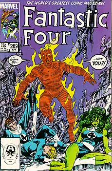
Fantastic Four #289
by John Byrne
Here, Johnny is at his normal power level. Some of the more signifcant details of his costume (gloves, boots, etc.) are seen, but anything less noticable is still hidden. Johnny claims to be at nearly 800 degrees Farenheit at this level.

Fantastic Four vol. 3 #2
by Alan Davis
By reducing the depth of his plasma covering even more, Johnny and his costume are almost completely discernible. You can easily see the "4" logo on his chest, but minutia such as his belt buckle are still somewhat obscured.
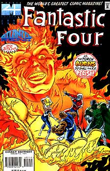
Fantastic Four #401
by Paul Ryan
Although this image does not take place within the context of the story itself, but there is no reason why Johnny could not reduce his plasma sheath to such a thin layer that even the seams on his gloves are easily distinguishable.
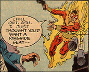
Peter Parker, the Spectacular Spider-Man #103
by Rich Buckler
Johnny briefly donned this "Blaze" costume to help Spider-Man. He abstained from flaming on entirely to conceal his real identity, but readers can clearly see his costume beneath his flames. It seems likely that such a thin layer of plasma would create insufficient heat to support him in flight, thus explaining the rarity of his using it. (Throughout the story he is only shown landing/falling in this this state.)
I believe these design differences were unintentional. It seems to me very doubtful that many artists took the time to think much about the transparency of Johnny's plasma coating. Marvel has yet to officially explain these differences, but I think my explanation holds a great deal of merit. A combination of oversights and artistic license have evolved into a plausible theory about a minor aspect of the Human Torch's power and perhaps one day I will be able to incorporate my ideas into the Marvel Universe.
Many artists have drawn the Human Torch over the years. While nearly every character Jack Kirby designed has undergone various "transformations" (beyond simple costume designs) at the hands of different artists, the Human Torch has almost always been depicted the same way. But occasionally Johnny does undergo a treatment to alter his flaming form, and this document will explain why this can be legitimized beyond a standard "artist's interpretation" clause.
First, we need a quick analysis of Johnny's flame power. Although he is often believed to become a sort of living fire, his physical form does not alter in any way. Johnny does in fact surround his body with a red-hot plasma that gives him the appearance of being on fire. This plasma is of course what gives him his famous red hue when he is flamed on. (If he did become entirely composed of fire, he would have no physical form to be able to carry objects nor would any physical attack ever harm him.) It stands to reason that Johnny can control the depth of this plasma sheath at will in connection with his temperature, thus altering his appearance when flamed on.
Below are several interpretations of the Human Torch. You can easily see the progression of detail in each drawing as Johnny's plasma covering becomes thinner and thinner.

Fantastic Four #324
by Keith Pollard
As you can see in this first image, Johnny is at his highest intensity. In fact, this particular image portrays Johnny at a level even higher than his normal nova blasts, as he had recently underwent changes during the Inferno story arc. His plasma layer would here be at it's thickest, and nearly all of the details of his form are hidden beneath his firey sheath. Normally this depletes all of Johnny's energy, causing him to immediately flame off; therefore, he is generally only seen this way for brief periods of time.

Fantastic Four vs. the X-Men #3
by Jon Bogdanove
Shortly before this panel, Johnny had accidentally burned the mutant Storm. He was understandably upset with himself and raced through rigorous training exercises, attempting to further hone his abilities. His powers would most likely be at their normal upper limit under these circumstances. You can see his musculature and basic form beneath the flames, but the details of his costume are still obscured.

Fantastic Four #289
by John Byrne
Here, Johnny is at his normal power level. Some of the more signifcant details of his costume (gloves, boots, etc.) are seen, but anything less noticable is still hidden. Johnny claims to be at nearly 800 degrees Farenheit at this level.

Fantastic Four vol. 3 #2
by Alan Davis
By reducing the depth of his plasma covering even more, Johnny and his costume are almost completely discernible. You can easily see the "4" logo on his chest, but minutia such as his belt buckle are still somewhat obscured.

Fantastic Four #401
by Paul Ryan
Although this image does not take place within the context of the story itself, but there is no reason why Johnny could not reduce his plasma sheath to such a thin layer that even the seams on his gloves are easily distinguishable.

Peter Parker, the Spectacular Spider-Man #103
by Rich Buckler
Johnny briefly donned this "Blaze" costume to help Spider-Man. He abstained from flaming on entirely to conceal his real identity, but readers can clearly see his costume beneath his flames. It seems likely that such a thin layer of plasma would create insufficient heat to support him in flight, thus explaining the rarity of his using it. (Throughout the story he is only shown landing/falling in this this state.)
I believe these design differences were unintentional. It seems to me very doubtful that many artists took the time to think much about the transparency of Johnny's plasma coating. Marvel has yet to officially explain these differences, but I think my explanation holds a great deal of merit. A combination of oversights and artistic license have evolved into a plausible theory about a minor aspect of the Human Torch's power and perhaps one day I will be able to incorporate my ideas into the Marvel Universe.
One of the things I like to give as gifts, when I can afford it, is original art. I think it makes for a unique and clearly thoughtful gift in the first place, and directly supports the creative individuals actually doing the art. There are two challenges to that, though.
First, there can sometimes be the physical transportation of the art. Particularly if you have to mail it. Of course, many artists are happy to ship the art directly to the recipient, but then it's difficult if you want to add a card or a personal note or something. This is admittedly a minor "problem" -- more of an inconvenience, really -- but still something that needs to be considered.
Second, there's the issue of what to get art of. Would they prefer a cartoon of themselves, just something cool and imaginative, a portrait of their favorite character..? And if it's a character or something specific, who is that? They might have lots of Superman memorabilia lying around, but maybe they really like Flaming Carrot a lot more and just don't have as much stuff because there hasn't been as much made.
But I caught than Daniel Govar has a clever (I think) solution: gift certificates! Here's what he posted on Facebook recently...
It's a really ingenious idea, and one I should think any artist who's open to taking commissions should consider!
First, there can sometimes be the physical transportation of the art. Particularly if you have to mail it. Of course, many artists are happy to ship the art directly to the recipient, but then it's difficult if you want to add a card or a personal note or something. This is admittedly a minor "problem" -- more of an inconvenience, really -- but still something that needs to be considered.
Second, there's the issue of what to get art of. Would they prefer a cartoon of themselves, just something cool and imaginative, a portrait of their favorite character..? And if it's a character or something specific, who is that? They might have lots of Superman memorabilia lying around, but maybe they really like Flaming Carrot a lot more and just don't have as much stuff because there hasn't been as much made.
But I caught than Daniel Govar has a clever (I think) solution: gift certificates! Here's what he posted on Facebook recently...
I've been finishing a handful of existing commissions and wrapping up projects, but wanted to open up commission requests for the holiday as well as offer gift commissions (pictured).Govar's got a few stipulations, of course -- you can't use one of these to get him to draw everyone who was ever a member of the Justice League for example! -- but he's got those clearly spelled out on the certificate itself. And his use of a serial number/code to identify who has purchased what also means that the recipient just has to contact him, and doesn't have to mail back the certificate or somehow prove they've physically got one of these.
These cards come mailed and may be given to loved ones for future commissions. #giftofart #art #commission I have a number of these at 9x12 and 12x16 sizes.
I'll be adding some more daily sketches here over the next couple of weeks.
My online store: http://danielgovar.bigcartel.com
It's a really ingenious idea, and one I should think any artist who's open to taking commissions should consider!
Kleefeld on Comics: On Business: Marvel Subscriptions
http://ift.tt/2xzQzx3
http://ift.tt/2xzQzx3
High Moon: Bullet Holes & Bite Marks: Afterword
http://ift.tt/2iMZfxc
http://ift.tt/2iMZfxc
Kleefeld on Comics: On History: Thomas on Kirby on Eastman/Laird
Patreon: MTV Geek Classic: Kleefeld on Webcomics #42: Review, "A History of Webcomics"
Kleefeld on Comics: Weekly Comics Links
http://ift.tt/2z4Ytm0
http://ift.tt/2z4Ytm0
FreakSugar: Webcomics Wednesday: Why Not Go Right to Crowdfunding?
Kleefeld on Comics: On -isms: Can't Justify Retcons?
Patreon: MTV Geek Classic: Kleefeld on Webcomics #43: Automation
I'm going to reach into my own archives a bit today. Here's an "Incidental Iconography" piece I wrote back in 2005 on Sky Masters of the Space Force. It originally ran in The Jack Kirby Collector #43...
In the past three columns, we’ve looked at characters that have enjoyed, largely through their associations, a fair amount of notoriety. In part because of their association with Jack, naturally, and in part because they were woven in the tapestry-turned-juggernaut that is Marvel. One could easily argue that the Wizard doesn’t garner the recognition of, say, Dr. Doom or Darkseid, but he’s certainly had a greater longevity and proclivity than Sky Masters.
Sky Masters is one of Jack’s lesser seen creations, due largely to the fact that it hasn’t been reprinted very often and the reprints that have been published are frequently in limited quantities. But it is summarily a beautiful work on several levels, not the least of which is the amazing collaboration of Jack Kirby and Wally Wood. I highly recommend Greg Theakston’s Complete Sky Masters, which reprints the comic strip in its entirety, but if that proves itself to be unavailable, I might also suggest a trip to the local library to browse their old newspaper collections. Well worth examining for anyone with an interest in Jack’s art.
Sky Masters of the Space Force was an action/adventure drama which was, although perhaps a bit more dramatic than the real space program, fairly well steeped in contemporary space theory. The “Sky Masters’ Scrap Book” especially appeared every Sunday and provided insights into what was actually being worked on and considered by the U.S. government. The main Sky Masters strip tended to take those ideas and extrapolate stories based on what life might be like should those ideas start bearing fruit.
What is particularly interesting about the strip visually, and why we’re focusing on it in this issue’s “Incidental Iconography” is that Jack’s designs seem be based more on fact than in imagination. With many of Jack’s creations, the overall design of a character was based on what Jack thought would make for a powerful visual. A quick look at Mr. Miracle and his Aero Discs is proof enough for that. With Sky Masters, Jack’s work is founded more in reality and his artwork is reflective of that.
Look at Sky’s flight suit from few weeks of the strip. It was a slightly simplified capstan partial pressure suit, and seems to most likely be based of the MC-3 model introduced in 1956 (right). The ribbing along the arms and legs is particularly telling. The headpiece is based on the K-1 assembly, a fiberglass helmet often used in conjunction with various versions of the pressure suit in the 1950s. These are both notable departures from “classic” science fiction of the era, where the Buck Rogers unitard and fishbowl helmet were more commonplace.
Shortly into the series, however, the space suit design changes. Were Vince Colletta inking the series, I might chalk this up to his tendency to simply Jack’s artwork for the sake of speed, but this was inked by Wally Wood and he was clearly still putting a great deal of effort into the strip. The suit changes to a looser fitting design with less visual ornamentation, and this does indeed seem to be reflective of further research on Jack’s part. The MC-3 series was not, in fact, designed for extended space flights, but more for sub-orbital use. Right around the time the strip began coming out, astronauts were switching to a full pressure suit system that could handle the depths of outer space. Indeed, full pressure suit designs were only first requested by the U.S. Air Force in 1955 and eventually resulted in the MC-2 full pressure suit (left). (Yes, I realize this seems like a counter-intuitive naming convention, and I have yet to find an adequate explanation for it.) The design was refined and modified before the final versions went into production in 1958, one year before Sky Masters.
The design is, unfortunately, less powerful. Instead of the form-fitting “action” suit that seems to befit the hero of an adventure strip, we have a bulky, unglamorous bag with no decoration to speak of. It is interesting to note, though, that it is this design that carries through – after a fashion – into Challengers of the Unknown and Fantastic Four. To his credit, though, Jack tightens the suits somewhat for those series, making them essentially a more dynamic version of lycra that most superheroes of the time wore. Of further interest is that Jack maintained some continuity within Sky Masters by keeping the K-1 helmet instead of “upgrading” to the more integrated helmet style seen with MC-2.
Curiously, the space suits shown in the Sunday strips (which were actually running a separate storyline from the weekday strip) are of a markedly different design. More interesting is that this design seems to have not been taken from government designs, but from the cover of the then-recently-published Robert A. Heinlein novel, Have Space Suit – Will Travel. The last few Sunday strips revert to the weekday strip suit designs; however, as shown in Complete Sky Masters, this can be attributed to Jack swiping his own, earlier material for sources. Indeed, the last Sunday strip was entirely lifted from previous artwork, including one panel from his attempted Space Busters comic strip. This may suggest that the Sunday strip was more readily lifted from the more fictional Space Busters, and may account for the differences in suit design.
A final design change that should be noted is one of practicality. The series’ second multiple-person space flight added the characters’ surnames emblazoned across the tops of their helmets. This was clearly done to distinguish one character from the next, as the space suits themselves had a unifying effect on how the characters looked, something not seen in Sky’s original solo flight storyline. By now, Jack surely realized that his drawings that were appearing in the funny pages were sometimes subject to worse printing conditions than those in comic books. One can see, too, in Wally’s inking a decreasing emphasis on textured details and a greater emphasis on well-placed spotted blacks. A simple and ready solution, of course, presents itself with the large helmet area where character names can be easily and logically written. This was carried throughout the series any time characters could not be distinguished by their facial features.
Sky Masters is an interesting case study in that it’s loose basis in reality can point to clear source material for Jack’s designs. Additionally interesting is that the extremely limited nature of the strip showcases Jack’s own design decisions more readily. We don’t have multiple inkers or, more dramatically, large time intervals between renderings that have a substantial impact on the visual forms. Sky Masters provides us with a look at what Jack was working on consciously in his art, what you might call “Intentional Iconography.”
Over the past year or two, Marvel has revealed that one of the founding member of the X-Men -- Iceman -- is gay. Not surprisingly, a lot of fans became upset with this, pointing to literally a half century of stories that show no indication that Iceman might be gay. At least when Northstar's sexuality was revealed in 1992, there had been hints at it almost from the start as creator John Byrne had initially conceived of the character as gay but was editorially forbidden to expressly state that; Byrne then continued to write the character with that in mind, and it was able to be inferred by the readers. But Iceman had basically been written as heterosexual, so some fans became upset at the change calling it a terrible retcon.
Here's the thing, though... how many "retcons" like this do we see in real life? Think about this...
In the past week, Anthony Rapp accused Kevin Spacey of making sexual advances towards him years earlier. Spacey, in his formal apology this weekend, also revealed that he was gay and had had "romantic encounters" with men throughout his life. But until this weekend, he presented himself as heterosexual. Virtually everybody who has seen him in The Usual Suspects or Superman Returns or House of Cards or whatever 'read' him as straight. There were a few rumors started in the late '90s that he might be gay, but he actively denied them and was seen dating women. To the general viewing public, he was heterosexual.
But now, coming out in 2017, that effectively retcons a good portion of his life. I can almost guarantee you no one will be able to watch American Beauty again in the same way, now knowing he's gay.
And he's hardly unique. Choose any public figure that remained closeted until after they'd achieved some level of celebrity. George Takei, Jodie Foster, Rosie O'Donnell, Michael Stipe, Ellen DeGeneres, Ricky Martin, Neil Patrick Harris, Wanda Sykes, Jillian Michaels, Jason Collins, Anderson Cooper... They were all assumed to be heterosexual by the vast majority of people who'd heard of them... until they weren't. They came out, and suddenly they'd just retconned their life in front of you.
And, undoubtedly, they lost some fans by doing so, but Ellen has remained a ratings topper for years, as has Anderson Cooper 360°. R.E.M. continued to sell tons of albums, getting repeatedly nominated for and often winning Grammies, MTV Music Awards, and others, and was inducted into the Rock and Roll Hall of Fame the first year they were eligible. Arguably, Takei's career is better and more active since he's been out than at any other time except perhaps during his tenure on Star Trek. All of which is to say that the number of fans any of them lost by coming out is negligible.
Despite the retcons that changed how you now look on their past work.
My point is that retconning a long-standing character like Iceman isn't really a retcon any more than the actual lives of the people I've listed above. (And so, so many others!) Sure, a comics company can totally mishandle how a character is outed and any criticism of the execution can be valid, but the basic concept? The notion that readers learn someone who they've for years thought was straight really isn't? That happens in real life every single day.
- Aleesha Harris talks with rapper A$AP Twelvyy about comic books and their influence on him.
- Christopher Maag has a fairly extensive write-up on letterer Taylor Esposito.
- Hannah Berry, Emma Saville, Rich Johnston, and Paul Gravett recently spoke on a comics roundtable on TRT World.


